使用 Material-UI 的 component
回憶
前面三天都是在談 Redux 關於前端的資料流,今天要談一個「非必要」的 react component 套件:Material-UI。它是Material Design 的 react 實作套件,它用來提供畫面的組件 (component),像是 Button, Input, Dialog…等,充分地體現出 React component 讓我們以組件的概念組裝畫面。
我們曾在Day 12 - 二周目 - 準備起程深入後端 中提到設計師做完設計稿後,會由一個前端工程師,做「切版」的工作,一般會寫出 HTML + CSS + Javascript。若前端框架採用 React,我們會把他們割一割封裝在各個 component,最後用 component 組裝畫面。
然而,不是每家公司都有「切版」的工程師。若只是單純的做後台網站,沒有對廣大的用戶,就不會講求畫面多絢麗、使用者體驗多利害,所以就有這種已經做好的畫面樣式的 component 可以直接使用,像是:Material-UI(Google),Ant Design (螞蟻金服)…等。
目標
- 使用 Material-UI 的 component
- 如何對為 component 加入css 樣式
- 如何用 Material-UI
Grid排版
使用 Material-UI
Material-UI 功能特色:
- 大量的基本 component
- 樣式(css style)注入系統:
withStyles這個 HOC(high order component),可以注入/覆寫樣式 - 排版 component:
Grid
安裝 Material-UI
Material-UI 歷經多次的 API 改版,現在的套件變的比較有組識了,基本元件全放到 @material-ui/core 中
- 複制 Day 23 - 二周目 - Redux 串接 React 與 Redux DevTools 的專案
hello-react - 安裝
material-ui/core: 安裝npm install @material-ui/core --save - 安裝
material-ui/icons(可選): 安裝npm install @material-ui/icons --save, 這套件提供一些svg(Scalable Vector Graphics) icon
大量的基本 component
體驗一下 Material-UI
我們之前在 hello-react 中加入了一個 button 來發出一個 action,如圖 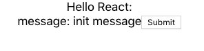
現在我們來換成 Material-UI Button。修改前試想一下,我們要改的是畫面,所以應該改哪個資料夾的檔案呢?actions/stores/reducers/components/containers 哪一個? 若你之前有跟上文章的內容應該可以想到,答應就是
1components
它是掌管畫面的資料夾,所以改 components/LoginBox.js
 1// components/LoginBox.js
 2import React, { Component } from 'react';
 3import Button from '@material-ui/core/Button';
 4
 5class LoginBox extends Component {
 6  render() {
 7    return (
 8      <div>
 9        message: {this.props.message}
10        <Button onClick={this.props.onClickSubmit}>Submit</Button>
11      </div >
12    );
13  }
14}
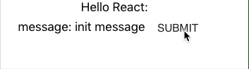
我們把 html tag button,換成是 Material-UI component Button。存檔後就完成了,看結果
如何?很容易吧! 有沒有體驗到下面的感覺呢?
- Flux framework 資料夾結構的分類
- React component 可以重構、組裝畫面
- JSX 語法方便替換 html tag
這麼多 component, 要怎麼用 Material-UI?
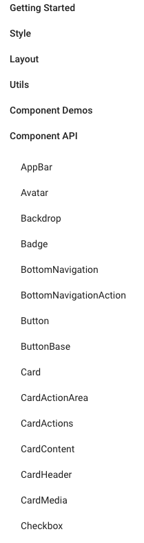
一打開 Component API 有沒有嚇一跳呢?要怎麼把它們組起來?
其實,可以不用一個個查,常用的 Demo 都有人整理好了,只要開 Component Demos
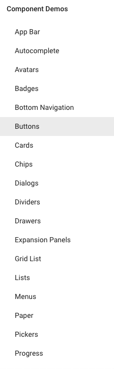
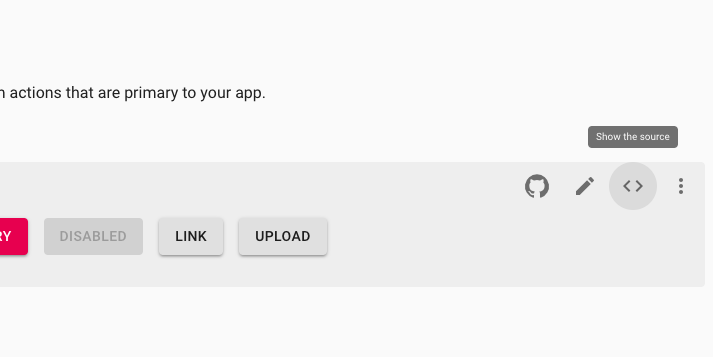
每個 Demo 頁面最下面還很貼心的附上相關的 API 連結,就可以進去看更多 component 用法。
樣式(css style)注入系統:「封裝 sytle」 或 「修改/替換樣式」
幾乎所有的 Demo code 最後面都會看到 withStyles 這個 HOC,如下圖:
1styles => component => component
當 withStyles(styles) 時就是函數:
1component => component
它把 component (class) 送入,產生新的 component (class)。不僅如此,它還把注入的 styles,放在 classes prop 中,你就可以在 component 使用注入的 style。
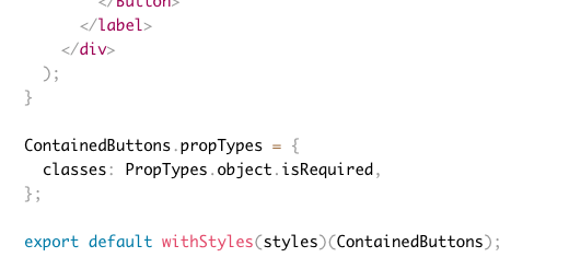
因為 withStyles 會把樣式注入 classes prop 中,所以 component 的 prop 定義 (propTypes) 要有 classes: PropTypes.object.isRequired。沒加入的話, Material-UI 也會警告你。
封裝 sytle
注意看到 styles 是巢狀物件,屬性名是 css class name,屬性值是 CSS 物件 (見 CSS Object Model)。 透過 withStyles(styles)(Component) 後,它會把 css class name 也當做 classes prop 的屬性名但是 值是字串,也就是:
1const styles = {
2  myRoot: {
3    backgroundColor: 'red',
4  }
5}
變成
1this.props.classes.myRoot = '某個含有 myRoot 的字串的 css class name'
舉個使用 withStyles 例子:
 1const styles = {
 2  myRoot: {
 3    backgroundColor: 'red',
 4  }
 5}
 6
 7const Box = (props) => (
 8  <div className={props.classes.myRoot}>  <------ this.props.classes.myRoot 是字串,不是 styles.myRoot (CSS 物件)
 9    hi
10  </div>
11);
12
13const withStyleBox = withStyles(styles)(Box);
14
15// uasge: <withStyleBox />
加載多個 style / 加載多個 class name
當你知道事實
1this.props.classes.<style anme> = <string>
你會知道 component 如何加載多個 style:
 1const styles = {
 2  myRoot: {
 3    backgroundColor: 'red',
 4  },
 5  myLayout: {
 6    text: 'center',
 7  }
 8}
 9
10const Box = (props) => (
11  <div className={props.classes.myRoot + ' ' + props.classes.myLayout}>  <------ 就和加載多個 class name 一樣
12    hi
13  </div>
14);
15
16const withStyleBox = withStyles(styles)(Box);
17
18// uasge: <withStyleBox />
若你希望 props.classes.myRoot + ' ' + props.classes.myLayout 是動態的,可以使用 classnames 套件,有條件的控制名稱是否出現,如:
1classNames({ [props.classes.myRoot]: true, [props.classes.myLayout]: true }); // =>  props.classes.myRoot + ' ' + props.classes.myLayout
2classNames({ [props.classes.myRoot]: true, [props.classes.myLayout]: false }); // =>  props.classes.myRoot
覆寫(overwrite) style: 修改/替換樣式
假如我們打開 Button,往下看到 CSS API
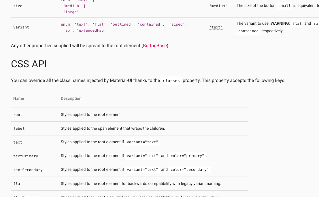
這就是你可以覆寫原始 component 樣式的 API。
直接舉個官網例子:
 1const StyledButton = withStyles({
 2  root: {
 3    background: 'linear-gradient(45deg, #FE6B8B 30%, #FF8E53 90%)',
 4    borderRadius: 3,
 5    border: 0,
 6    color: 'white',
 7    height: 48,
 8    padding: '0 30px',
 9    boxShadow: '0 3px 5px 2px rgba(255, 105, 135, .3)',
10  },
11  label: {
12    textTransform: 'capitalize',
13  },
14})(Button);
用 withStyles 就可以替換 root 和 label 原來的樣式。
最後一個功能是:排版(layout)。
排版 component:回應/響應式網頁(responsive web)
Material-UI 和 bootstrap 一樣,它提供 Responsive API,只不過是 component 版本的。
Grid 就是拿來做 responsive layout。它和 bootstrap 一樣採用 12-column grid layout(12欄網格系統)。
不管螢幕大小,一個 row 就是被切成 12 欄,你要設定排版怎麼分配欄位數。直接看例子:
 1<Grid container className={classes.root} spacing={16}>
 2  <Grid item xs={6} sm={4}>
 3    A
 4  </Grid>
 5  <Grid item xs={6} sm={4}>
 6    B
 7  </Grid>
 8  <Grid item xs={6} sm={4}>
 9    C
10  </Grid>
11</Grid>
你就知道怎麼用了,更多例子見 Grid Demos。
我們的心力還要花在設定 Breakpoints,每個 breakpoint 有固定的螢幕大小
1xs, extra-small: 0px or larger
2sm, small: 600px or larger
3md, medium: 960px or larger
4lg, large: 1280px or larger
5xl, extra-large: 1920px or larger
以上面例子來說:
xs指的是當螢幕大於等於 0px 時要採用的「分配欄位數」,所以上面的結果是:因為1A B 2CA和B的Grid各佔了6欄,它們剛好就是一個 row,所以C的Grid就會在下一 row。sm指的是當螢幕大於等於 600px 時,結果是:因為1A B CA、B和C可以剛好放滿一個 row 共 12 欄。
Hidden component
有時你會需要只有特定的螢幕大小,component 才會要出現/隱藏,這時候可以用 Hidden component。
文件中給個例子:
1innerWidth  |xs      sm       md       lg       xl
2            |--------|--------|--------|--------|-------->
3width       |   xs   |   sm   |   md   |   lg   |   xl
4
5smUp        |   show | hide
6mdDown      |                     hide | show
-
若
1<Hidden smUp>
2  ...may hidden dependent on screen size
3</Hidden>
你的螢幕大小若大於等於 600px ,
Hidden內的東西就會隱藏。反之,小於 600px 時會顯示。 -
若
1<Hidden mdDown>
2  ...may hidden dependent on screen size
3</Hidden>
你的螢幕大小若小於 1280px ,
Hidden內的東西就會隱藏。反之,大於等於 1280px 時會顯示。
總結
今天介紹了 Material-UI 的常用功能
- 基本 component 的使用
- 使用
withStyles樣式注入 - 使用
Grid操作12欄網格系統
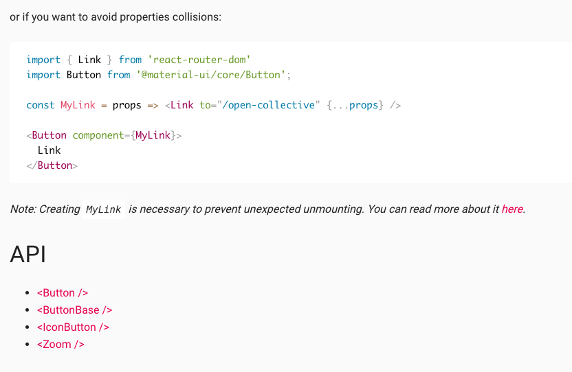
當沒有人寫做切版時,Material-UI 是一個可選方案。若你想做的畫面很絢麗、酷炫或太過客製化的 component,請花時間在 HTML + CS + Javascript中。若你願意包成 component 提供別人使用(如:React Date Picker),會有人感謝你的,
評論